


A vibrant, playful new identity for a long-running San Francisco music festival.

This parameters for this project were as follows: drop 'bluegrass' from the festival name, attract an audience with more women, broaden the scope of the festival with more music genres, and construct a new identity around the festival with a new theme.


Three different moodboards were constructed each with the goal of taking the festival in an entirely different direction. The first one focused on the feeling of nostalgia, the second one had a strong focus on motion through distortion, and the third one was centered around the idea of human connection and nature.
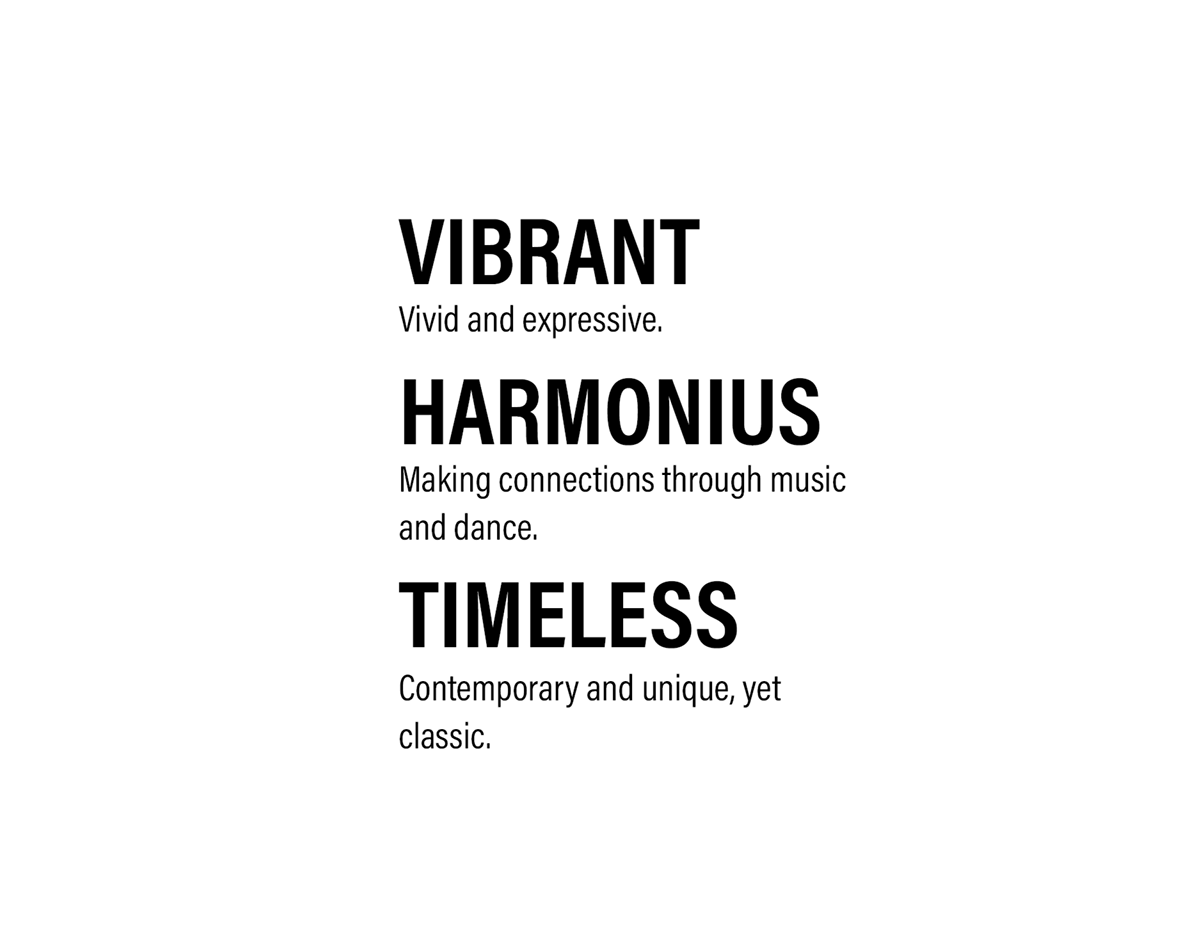
New brand descriptors were also introduced in order to establish a visual direction for the festival to go in.
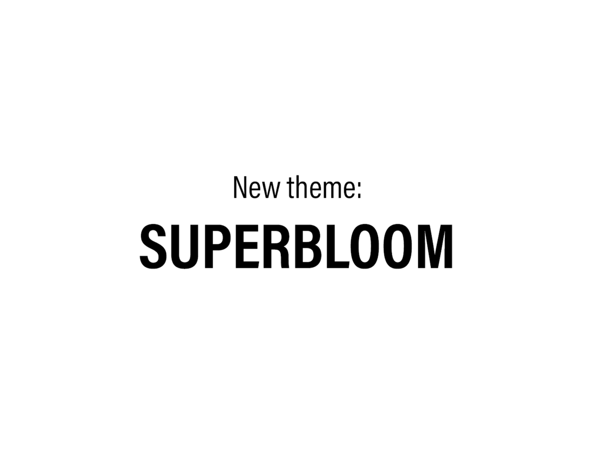
From the descriptors also came a new theme, SUPERBLOOM. This theme was chosen to reflect the growth of the festival and its patrons from a particularly rough start to the new decade. After the rainy season comes the superbloom.


A series of sketches was then created to figure out what the logo would look like with the moodboards in mind.


Several digital iterations of the logo were then created, which eventually spawned 3 final logos.


The final three logos selected are above, with each one having a sort of retro 70's look and feel.

Above is the final logo with a new color palette. The circular design represents unity while the flower icon reflects the festival's new theme and symbolizes growth.

Below are several pieces of collateral to show the new logo and brand in action, from various pieces of merchandise to signage.


Below are a few select spreads from a brochure that was created in order to promote the festival.


